Learn 2.0
The learning platform every student was forced to use, and quietly fought, when everything moved online. We reworked it around what they needed.
When teaching went fully online, the course platform stopped being a convenience and became the whole experience, and its friction landed on students who were already under pressure. We focused on one course's space and asked a blunt question: where does this get in the way, and what would we change if we listened to the people stuck using it?
Where it hurt
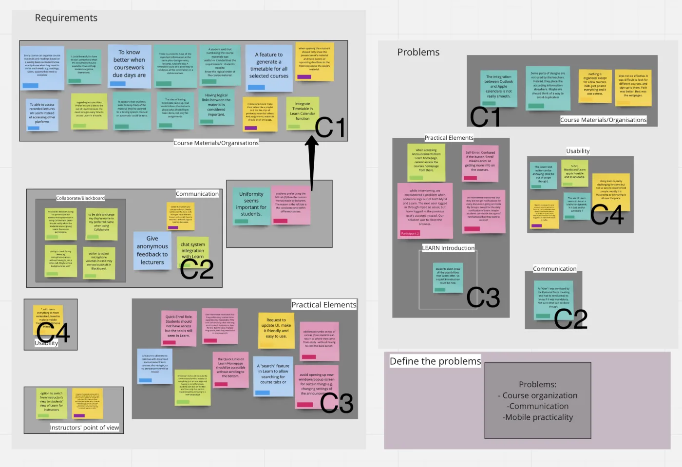
The interviews were consistent. Plans and timetables contradicted each other, so students were unsure what was due, and when. There was no checklist of tasks, which turned ordinary weeks into a low hum of "am I missing something?". Files and announcements were scattered and duplicated, so finding a single document meant hunting. Feedback was thin, and the chat was clumsy enough that people simply stopped using it. None of these are dramatic on their own, together they made a tool nobody trusted.
Rather than jump to screens, we turned that into a short, prioritised list of what the redesign had to deliver: clarity on what's due, materials you can find, a visible sense of progress, confirmation that work was submitted, communication that isn't painful, and a schedule you can trust.
From sketches to screens
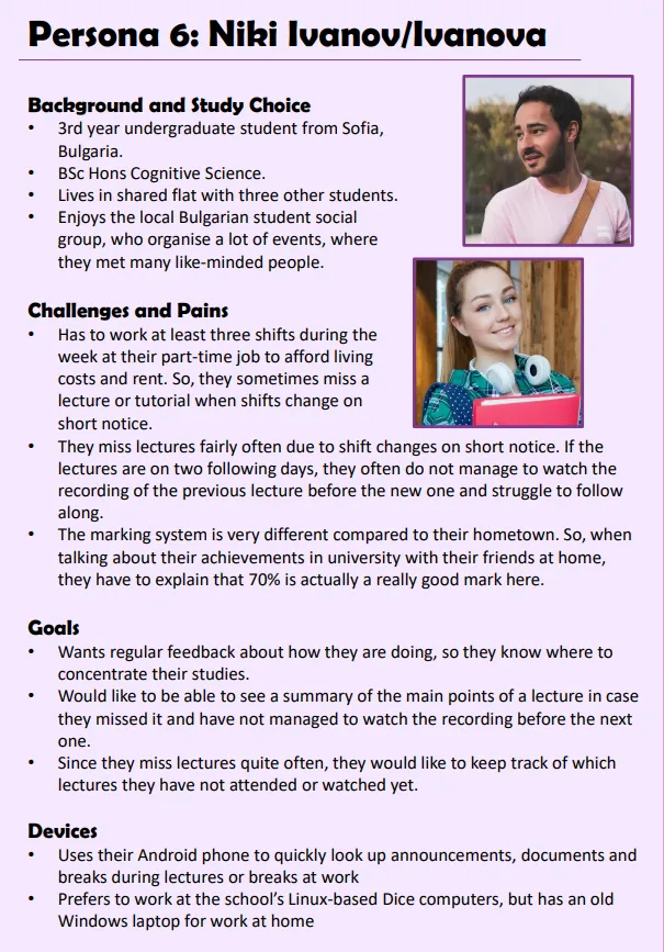
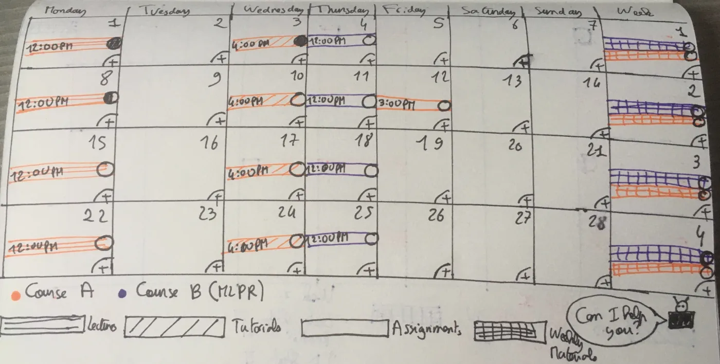
We anchored the work to two personas from the brief and moved deliberately: rough paper sketches to argue about the structure first, then higher-fidelity mockups in Balsamiq once the shape was right. Designing on paper before pixels kept the debate about the flow, not the styling.
The redesign
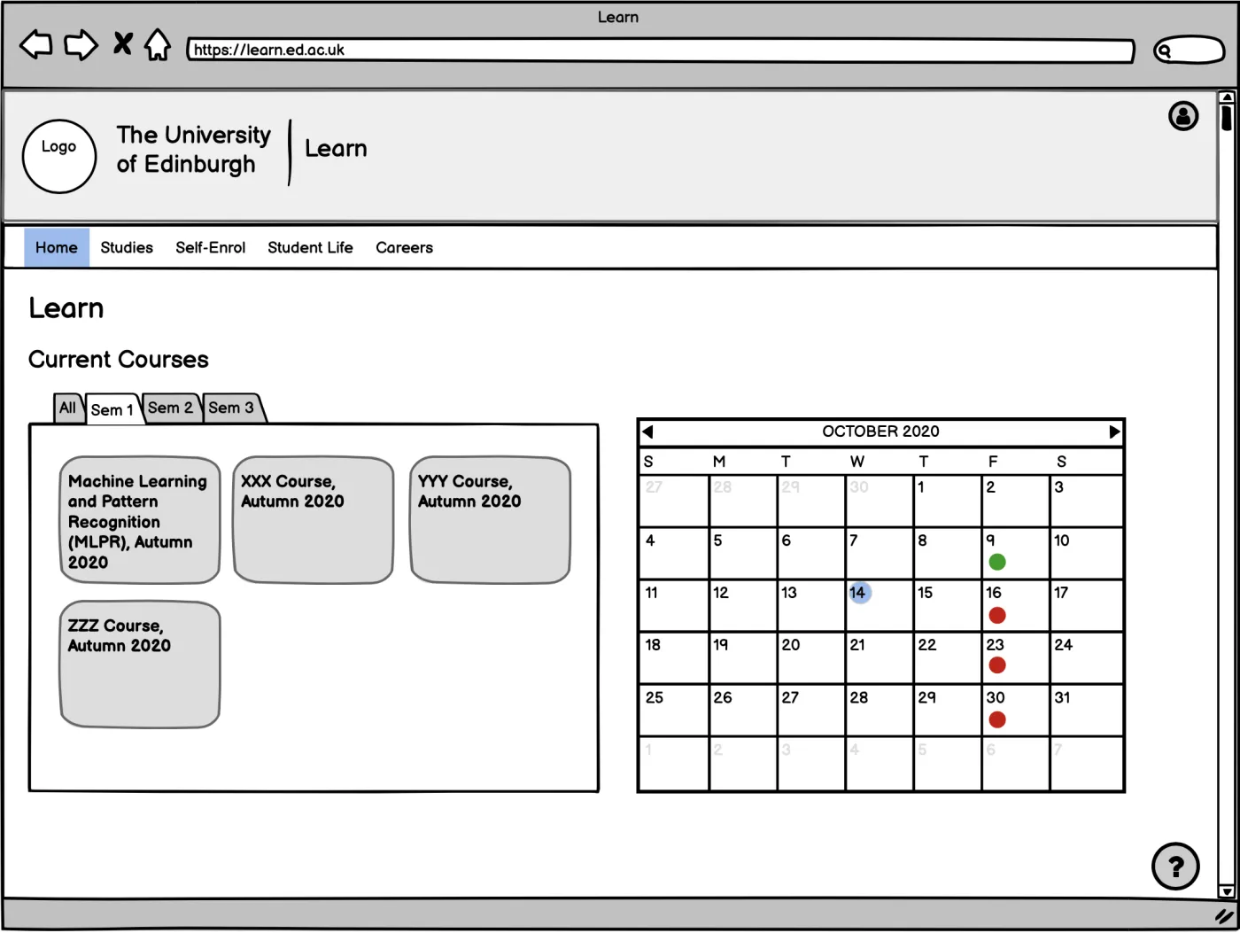
The homepage was rebuilt around orientation: courses segmented by semester, and an academic calendar that makes progress and upcoming deadlines visible at a glance, with a single floating action for whatever you most often need.
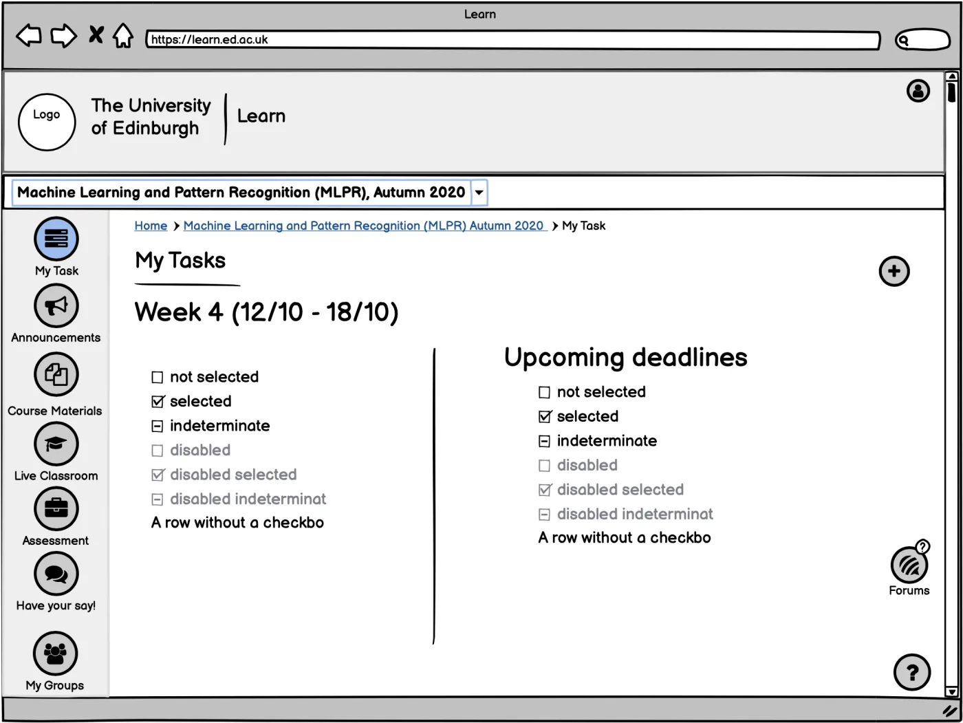
A dedicated My Tasks page answers the anxiety we heard most: a snapshot of the current teaching week, the tasks in it, the deadlines coming, and room to make it your own.
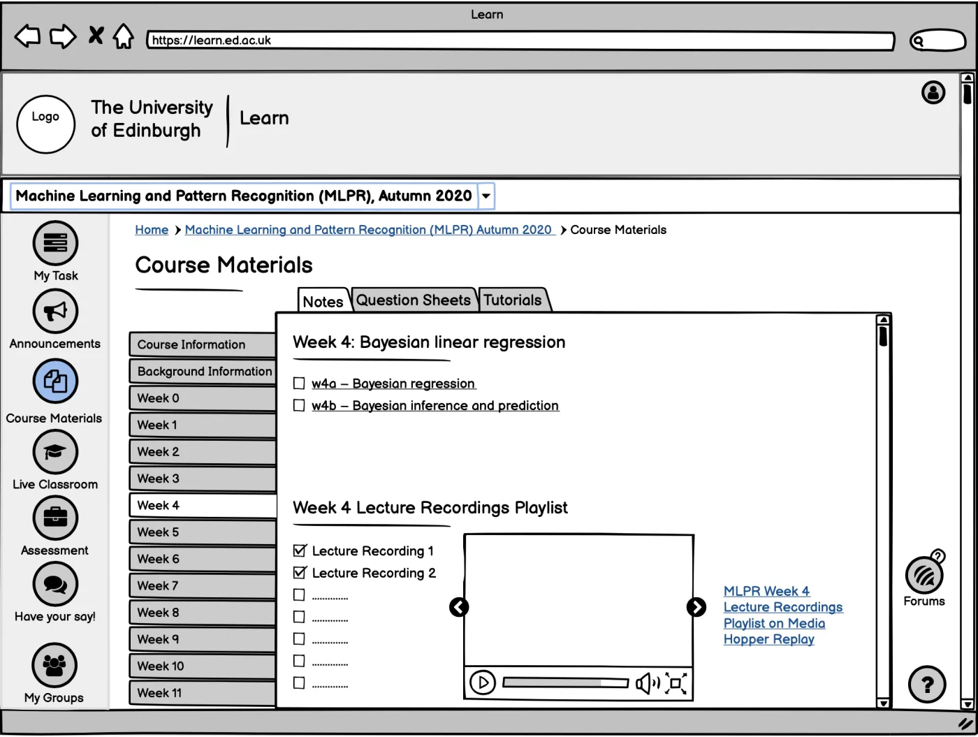
And the Course Materials page fixes the hunting: clean navigation between resources, a checklist so you can see what you've covered, and the ability to resume a video where you left it, straight out of what interviewees told us.
Working iteratively, keeping the two students in front of us and documenting every decision on shared sticky notes, kept the redesign honest. With more time, what I'd deepen is the persona research itself: more interviews would have let us separate user groups more sharply and prioritise even harder. A persona is only ever as good as the research underneath it, a lesson I carried straight into everything since.