Time-Scale
Everyone knows the feeling of one more episode becoming three. We wanted to understand why it happens, and design for awareness instead of just blocking.
Most screen-time tools treat the problem as a lack of willpower and answer it with a hard blocker, which people switch off within a week. We started somewhere else. We focused on students living alone and asked what happens, in the moment, when a study break becomes an evening. If we understood the behaviour, we could design for awareness rather than restriction.
Listening first
We ran interviews with students and, in parallel, each of us kept a screen-use diary for a week, because some of this behaviour is only honest when you catch it in yourself. We put the interview transcripts through a thematic analysis and clustered what emerged into an affinity diagram, letting the patterns surface rather than imposing our assumptions on them.
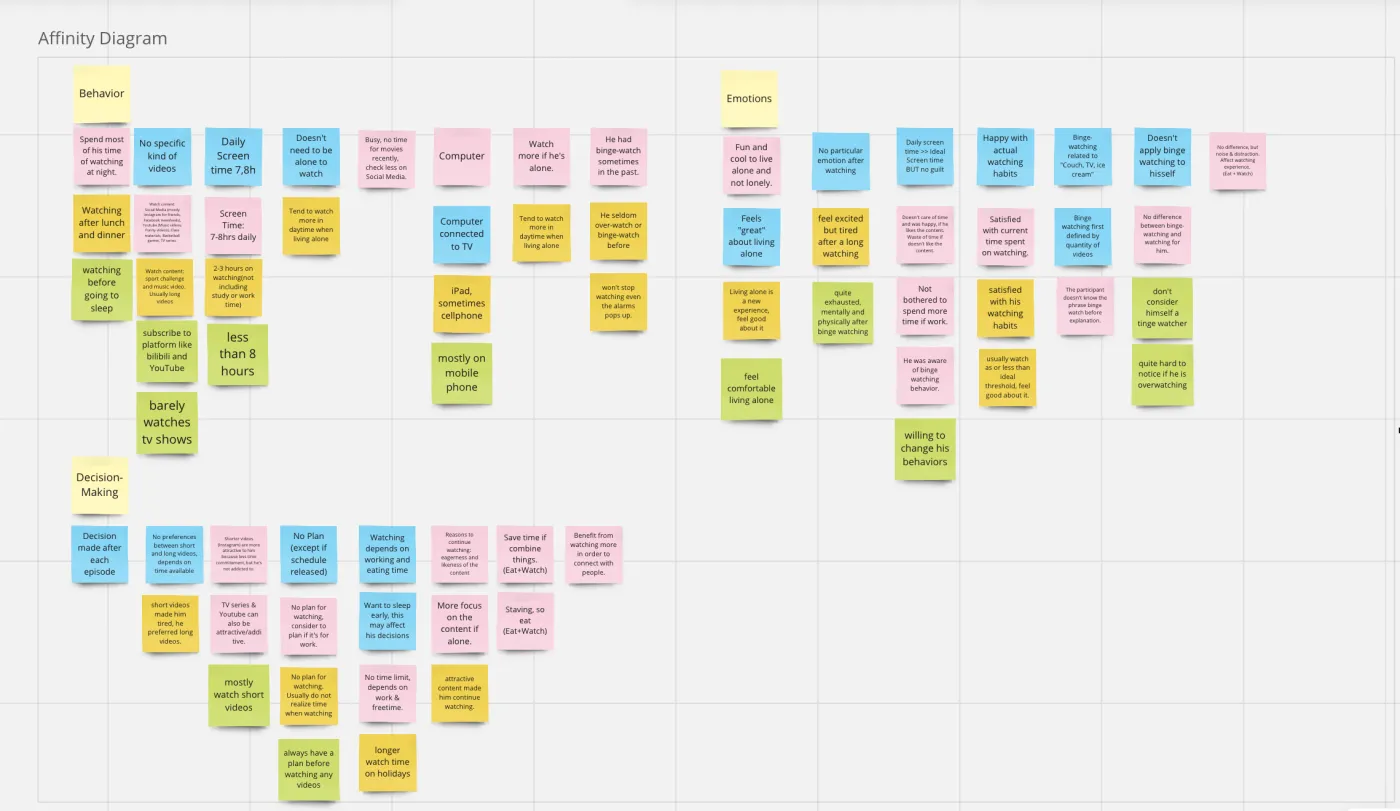
Two findings reframed the project. First, guilt was not the dominant emotion we had assumed it would be, most students were fairly at peace with their viewing. Second, the real trigger was structural, not moral: people set alarms, then lost track of time because the content pulled them past it, often across several devices at once, and often around meals, where watching had become a comforting routine. The problem wasn't weak will. It was that time had gone invisible.
Two people, not one
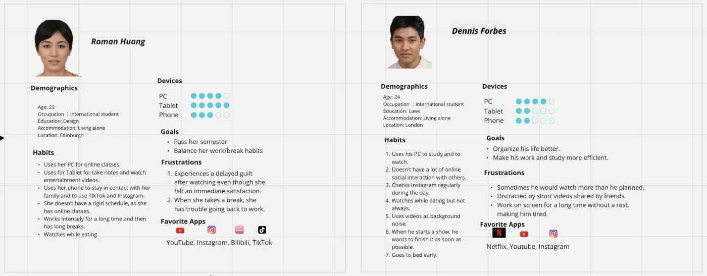
From the research we built two personas, separated by how anxious screen time made them feel. That distinction mattered: the calm viewer and the anxious viewer need very different nudges, and designing for an average of the two would have served neither.
A scan of six existing products confirmed the gap: none handled multiple devices well, none made time tangible, and none used well-timed, staggered prompts. Running the needs through a Kano model, three qualities stood out as the difference between a tool people tolerate and one they keep: dynamic interaction, a physical sense of time passing, and gentle, staggered nudges rather than one blunt alarm.
Making time you can hold
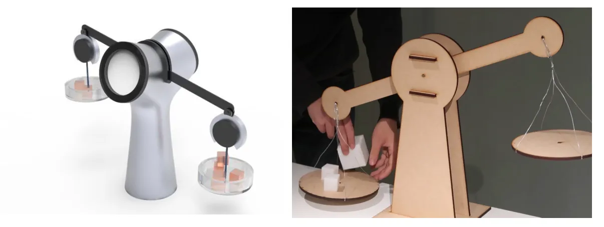
So we made time physical. The concept, Time-Scale, centred on a small time cube you keep beside you: a low-fidelity prototype built from wood and acrylic, with a gyroscope and Arduino sensing when you move it, paired with a high-fidelity digital interface. Because sustained, undivided attention is exactly what tips into overindulgence, the design asks for small, periodic engagement, a natural, low-friction break, rather than a wall that stops you.
What the tests told us
Early testing with the low-fidelity prototype was encouraging and specific: people wanted the break intervals to be theirs to set, not fixed, and consistent tracking across devices proved harder than any single tool could manage. With a small sample, some calls leaned on our judgement more than I'd want, so the honest next step is more rigorous data collection. The direction I'd take it: personalised intervals tuned to how someone watches, and, further out, reminders that adapt to the person rather than the clock.